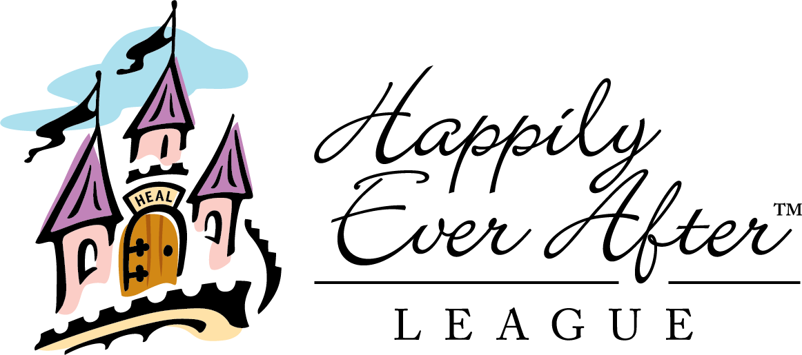
Happily Ever After League (HEAL) Fairytale Tea Brand Identity
HEAL is a nonprofit organization which offers support to mothers undergoing cancer treatment. Each year, HEAL hosts its Fairytale Tea, a charming and heartwarming fundraising event designed to bring the community together in support of the charity and its mission. As a reflection of the Fairytale Tea’s evolution and its pivotal role in HEAL’s awareness efforts for 10 years, HEAL sought an event logo and corresponding style guide to apply to all branded efforts for the 2018 event and beyond.
My Role:
Creative Direction / Brand Identity / Graphic Design
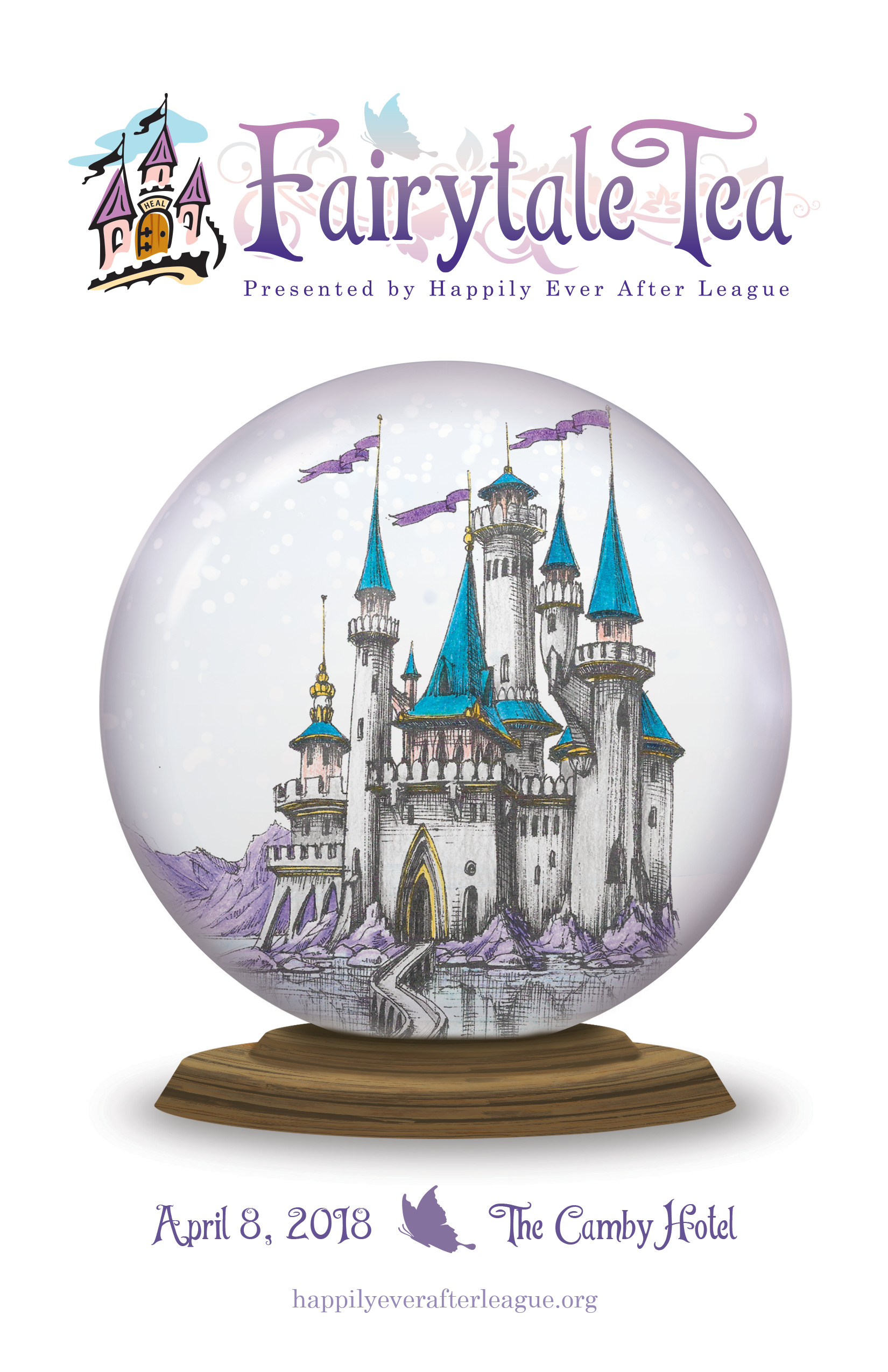
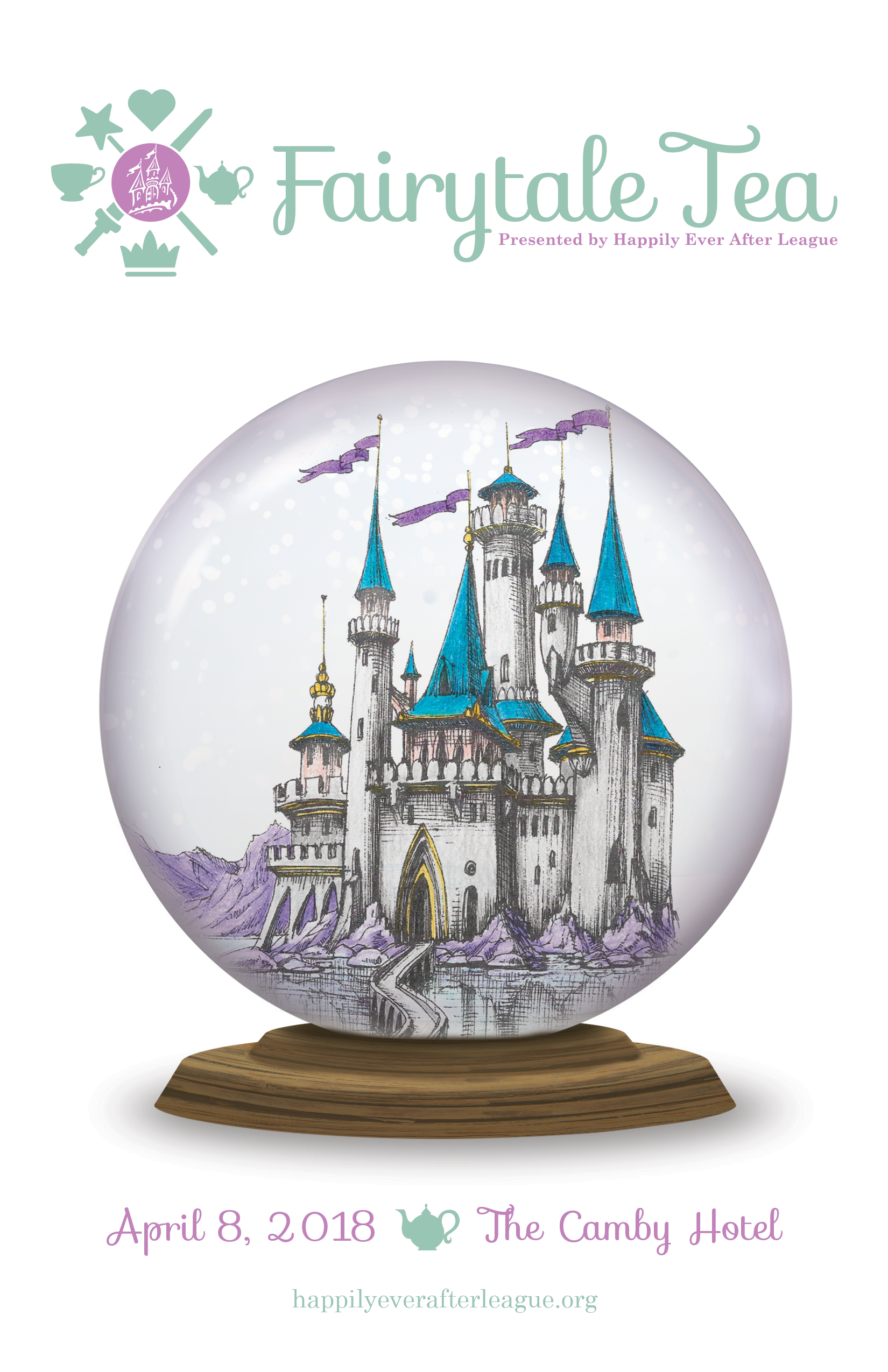
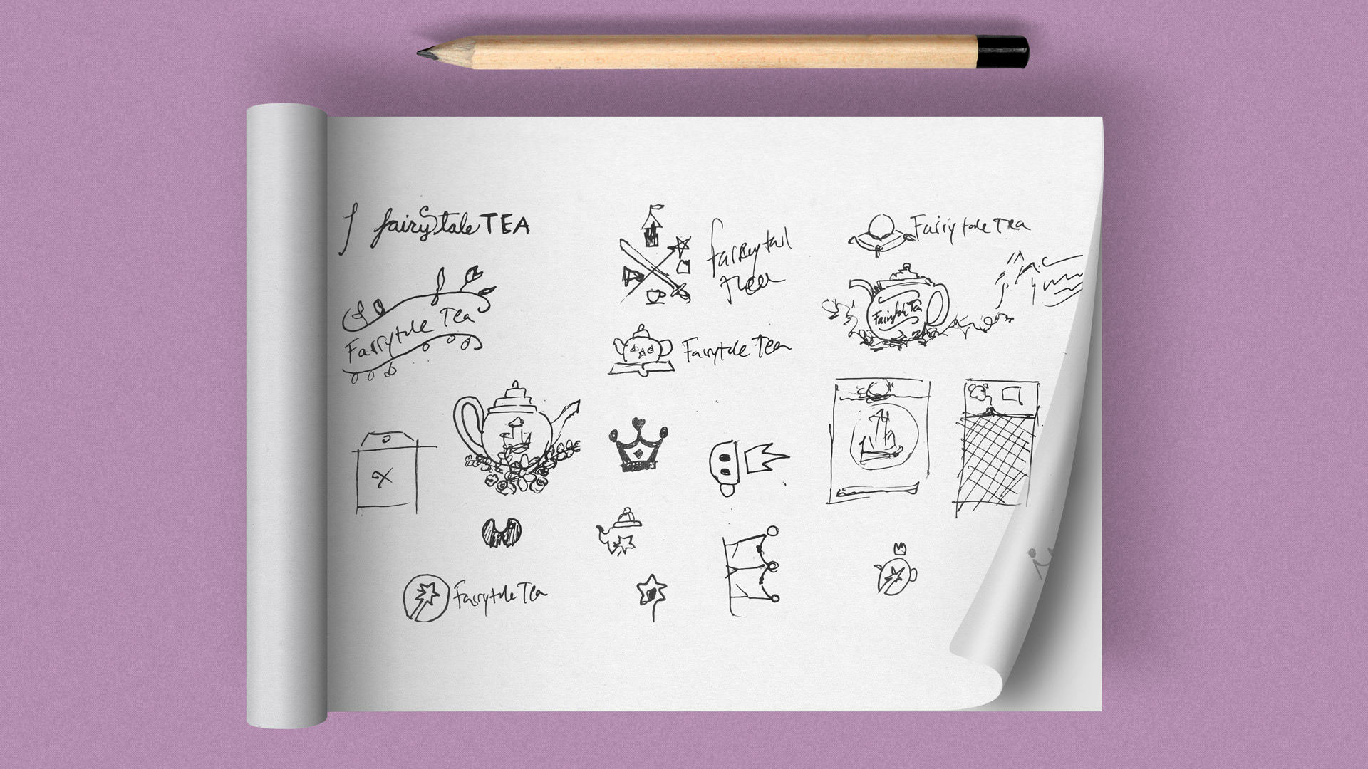
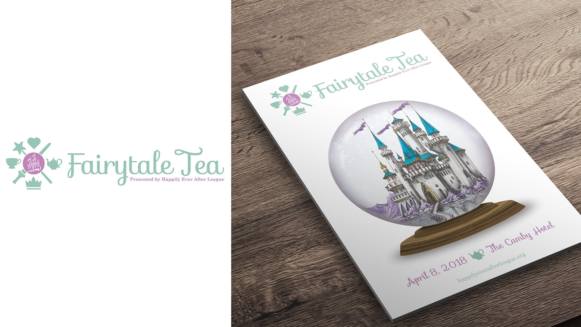
I created three (3) event logos to present to HEAL for final selection and approval. Each design had a unique, corresponding icon that would tie in the logo across all collateral. The first design was primarily text, with the HEAL logo serving as a watermark. All colors in the design were pulled from the HEAL logo, to ensure it visually and immediately connected the event to HEAL, and aligned with HEAL’s purpose, while reflecting the event’s uniquely lighthearted and clever voice. Its icon was a tiara. The second design took a more literal approach to incorporating the HEAL logo, and featured both a fanciful typeface and a butterfly icon, symbolizing the rebirth of the cancer survivors. The third logo incorporated a shield of tea and fairytale symbols, reflecting the lighthearted and youthful mood of the event. Its icon was a teapot. Ultimately, HEAL chose the second design, replacing the butterfly icon with the tiara from the first design.

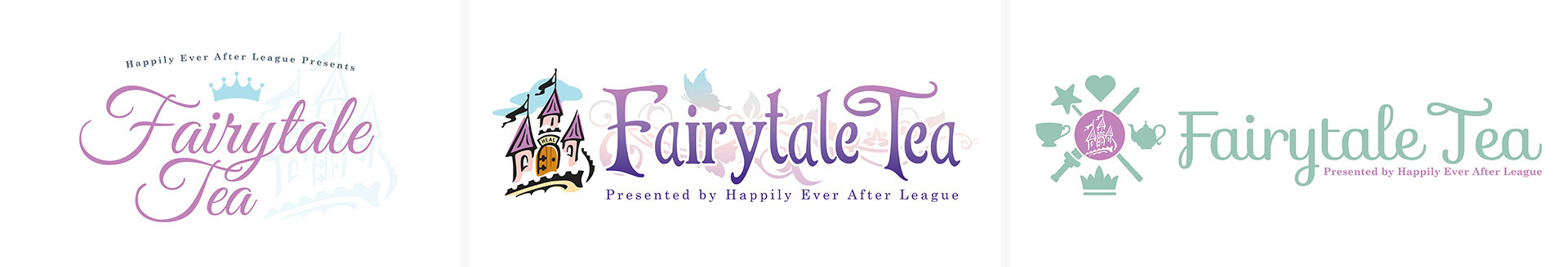
Logo Concepts
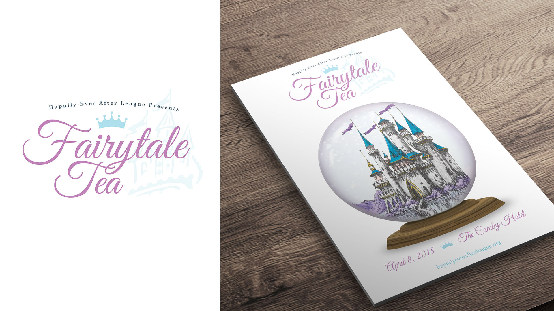
Logo Concept 1 with Program Art
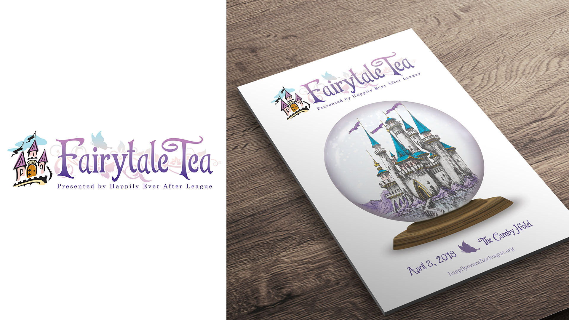
Logo Concept 2 with Program Art
Logo Concept 3 with Program Art